


Building a responsive design is one of the important parts of web development, and the navbar helps users to navigate through different pages of the website with ease.
In this, article, I will assume you have basic knowledge of HTML, CSS, and Javascript.
Getting started
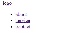
- Start with some basic HTML for layout
<!DOCTYPE html>
<html lang="en">
<head>
    <meta charset="UTF-8">
    <meta http-equiv="X-UA-Compatible" content="IE=edge">
    <meta name="viewport" content="width=device-width, initial-scale=1.0">
    <title>Document</title>

</head>
<body>
    <div class="nav">
        <div class="logo">
             <a href="#">logo</a>
        </div>
        <ul class='navbar'>
            <li><a href="#">about</a></li>
            <li><a href="#">service</a></li>
            <li><a href="#">contact</a></li>
        </ul>
    </div>
</body>
</html>
- Create and link your stylesheet to your HTML file
<link rel="stylesheet" href="style.css">
- Let’s style our navbar
*{
    padding: 0;
    margin: 0;
}
body{
    width: 100%;
    height: 100vh;
    box-sizing: border-box;
    font-family: sans-serif;
}
.nav{

    display: flex;
    justify-content: space-between;
    align-content: center;
    background:#000;
    color: #fff;
    padding: 1em 6em;

}
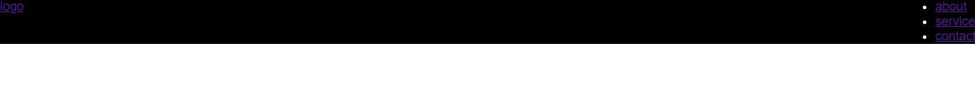
Using CSS flexbox properties navbar divs now aligned horizontally.
- Style the logo
    padding: 0 1em;
}
.logo a{
    text-decoration: none;
    color: #fff;
    font-size: 1.5em;
    text-transform: uppercase;
}
- Style the navbar list
.nav ul{
    display: flex;
    justify-content: space-between;
    align-content: center;

}
.nav li{
    list-style: none;

}
.nav a{
    text-decoration: none;
    color: #fff;
    padding-right:2em;
    text-transform: uppercase;
    font-size: 1em;

}
.nav a:hover{
    color: rgb(216, 185, 10);
    letter-spacing: 2px;
}

- Add the toggle bar in your HTML, you can use font awesome icon or your preferred icon.
<div class="nav">
        <div class="logo">
             <a href="#">logo</a>
        </div>
        <ul class='navbar'>
            <li><a href="#">about</a></li>
            <li><a href="#">service</a></li>
            <li><a href="#">contact</a></li>
        </ul>
        <div class="toggle">
            <span class="bar"></span>
            <span class="bar"></span>
            <span class="bar"></span>
        </div>
    </div>
- Style the toggle bar
.toggle{
    position: absolute;
    top: 1rem;
    right: 1rem;
    display: flex;
    flex-direction: column;
    justify-content: space-between;
    width: 30px;
    height: 21px;
    cursor: pointer;
}
.bar{
    width: 100%;
    background: #fff;
    height: 3px;
}
- Hide the toggle bar by changing display flex to display none
display: none;

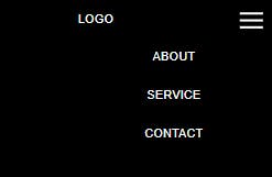
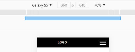
The navbar looks good on laptops, desktops, tablets, Ipad and large screens, we need to make it look good on mobile devices using CSS media queries.
- Let’s make our navbar responsive on a mobile device
@media (max-width: 480px){

    .logo{
        padding: 0 0.5em;
    }
    .toggle{
      display: flex;
    }

    .nav ul{
        padding-top: 3em;
        flex-direction: column;

    }
    .nav li{
        padding-bottom: 2em;
        text-align: center;
    }
- Let’s hide our navbar list
.nav ul{
        padding-top: 3em;
        flex-direction: column;
        display: none;

    }
Let’s show our navbar list only when we click on our toggle bar using javascript.
Create your script file and link it to your html file
Create a new variable and assign it the classname of toggle and the navbar list using document. queryselector().
let responsive = document.querySelector('.toggle');
let view = document.querySelector('.nav ul');
- Using javascript onlick event, write a function that check if the navbar list display = 'none' and dispalay block and the else statement set the navbar list to display none .
responsive.addEventListener("click" , function () {
  if (view.style.display === "none"){
    view.style.display = 'block'


  }
  else{
    view.style.display = 'none',

  }
});
Now, we have our responsive navbar, it's time to build amazing projects.